GUI Layout
In this chapter
- arrange components with rows, columns, grids and cards
- learn a repeatable process for building a layout
- style a component with your own SCSS
- files you touch:
models/Carrental.umlp,backend/src/main/java/carrental/CarrentalServerApplication.java,frontend/src/main/gui/gui/CarOverview.gui,frontend/src/main/gui/gui/CarForm.gui,frontend/src/main/java/gui/CarCreate.java,frontend/src/main/gui/gui/CarOverview.scss
A typical layout of a component consists of a combination of columns, rows and
grids. The mc.fenix.arrange package contains the corresponding components
GemColumn, GemRow, and GemGrid.
Note
These components are based on the flexbox layout and the grid layout.
More data to show
To make the process more realistic, let's add some data to a car:
class Car {
  String make;
  String model;
  String name;
  RentableStatus rentableStatus = RentableStatus.AVAILABLE;
  float costPerDay = 100.0f;
  float mileage = 0.0f;
}
Float literals
Write 0.0f, not 0. The generator copies the literal into the generated
Java code, where an int literal does not fit into a Float attribute and
the backend fails to compile.
Set the new attributes in the dummy data as well:
Car ford = CarrentalManager.carBuilder()
    .make("Ford")
    .model("Mustang")
    .name("GT")
    .costPerDay(200.0f)
    .mileage(1000.0f)
    .build()
    .get();

Car toyota = CarrentalManager.carBuilder()
    .make("Toyota")
    .model("Corolla")
    .name("LE")
    .costPerDay(25.0f)
    .mileage(61000.0f)
    .build()
    .get();

Car vw = CarrentalManager.carBuilder()
    .make("VW")
    .model("Käfer")
    .name("Herbie")
    .costPerDay(40.0f)
    .mileage(2500.0f)
    .build()
    .get();
Both new attributes have a default value, so the creation form from the
previous chapter keeps working. Still, a user should be
able to set the price. Add a field to CarForm and extend the builder:
@GemTextInput(
  labelText = "Cost per day:",
  inputType = "number",
  entry = car.costPerDay
),
import carrental.RentableStatus;
/* other imports */

CarrentalManager.carBuilder()
    .make(car.getMake())
    .model(car.getModel())
    .name(car.getName())
    .costPerDay(car.getCostPerDay())
    .mileage(0.0f)
    .rentableStatus(RentableStatus.AVAILABLE)
    .build();
You changed the class diagram, so restart the backend and update the frontend:
./gradlew :frontend:generate
The extended overview page
The CarOverview so far had a simple layout. Now we update it to an extended
layout configuration:
package gui;

import mc.fenix.basic.GemText;
import mc.fenix.basic.GemImage;
import mc.fenix.basic.GemButton;
import mc.fenix.arrange.GemColumn;
import mc.fenix.arrange.GemRow;
import mc.fenix.arrange.GemGrid;
import mc.fenix.arrange.GemCard;

import gui.navigation.NavContainer;
import gui.CarUpdate;

import Carrental.Car;

page CarOverview(List<Car> cars) {
  @NavContainer(content = [
    @GemColumn(rowGap = "10px", width = "50%", hAlign = "center", components = [

      @GemText(value = getAvailableCarsTitle(cars), size = "2rem", weight = "bold"),
      @iterate(Car c : cars) {
        carInfo@GemCard(
          title = c.make + " " + c.model + " " + c.name,
          component = @GemRow(colGap = "20px", vAlign = "bottom", hAlign = "space-between",
            components = [
              @GemImage(width = "200px", source = "assets/images/" + c.make + ".jpg"),
              @GemGrid(width = "auto", colGap = "5px", rowGap = "5px", rows = [
                [
                  @GemText(value = "Status:"),
                  @GemText(
                    value = c.rentableStatus,
                    color = c.rentableStatus == RentableStatus.AVAILABLE ? "green" : "red"
                  )
                ],
                [
                  @GemText(value = "Mileage:"),
                  @GemText(value = c.mileage + " miles")
                ]
              ]),
              @GemColumn(width = "40ch", rowGap = "10px", hAlign = "right", components = [
                @GemText(value = (c.costPerDay * 3) + "€ for 3 days", size = "1.5rem"),
                @GemButton(label = "Rent car", leftClick = rentCar(c)),
                @GemButton(
                  label = "Update car",
                  leftClick = navigate(@CarUpdate(car = c))
                )
              ])
            ]
          )
        );
      }

    ])
  ]);
}
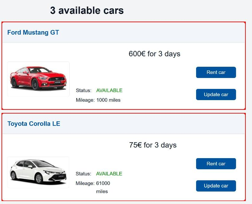
The result:
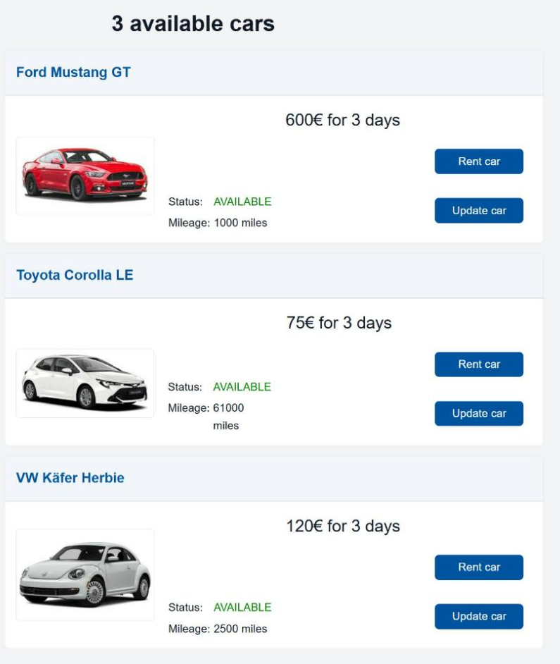
Note
The default root for images, set in the source parameter of GemImage, is
frontend/config/src/. The project ships pictures for the makes Ford,
Toyota and VW in frontend/config/src/assets/images/. A car with a
different make shows a broken image.
The styling process
The styling process is normally iterative with the following steps:
- Draw (or imagine) a sketch of the component with all of the parts laid out.
- Split the components with horizontal and vertical lines.
-
Draft the layout in the model according to the lines:
- components between horizontal lines are put into a
GemColumn, - components between vertical lines are put into a
GemRow, - components that are arranged in a grid pattern are put into a
GemGrid.
- components between horizontal lines are put into a
-
Repeat steps 2 and 3 if necessary.
- Fine-tune the layout using the properties of
GemColumn,GemRowandGemGrid.
Tip
Besides the three main layout components, you may consider using other
components, such as GemCard. You should also build your own layout
components if you notice the same layout pattern.
The following sections apply this process to the overview page. Each iteration performs step 2 (split) and step 3 (draft the layout).
Iteration 1: the page
First split with horizontal lines:
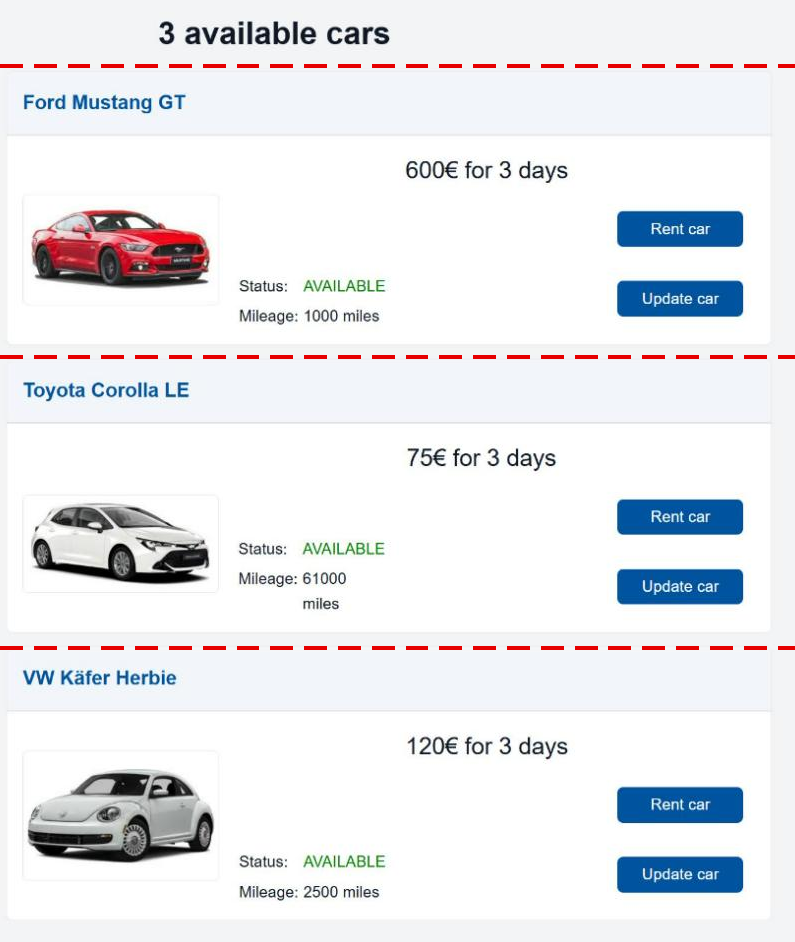
The parts are stacked vertically, so we use a GemColumn as the outermost
container:
@GemColumn(components = [
  @GemText(value = getAvailableCarsTitle(cars), size = "2rem", weight = "bold"),
  @iterate(Car c : cars) {
    /* image, text, buttons */
  }
])
The text component is in the right place, we have to arrange the content inside
iterate. Since the content for each car is arranged the same, we take the
first car as an example.
Iteration 2: one car
At this point, we could split the content like this:
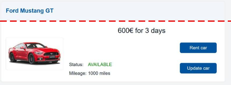
We could use a GemColumn again, but a better way is to use GemCard, which is
a fancier looking GemColumn suitable for grouping information:
@iterate(Car c : cars) {
  @GemCard(
    title = c.make + " " + c.model + " " + c.name
    /* image, text, buttons */
  )
}
Iteration 3: the card content
Next split with vertical lines for the contents of the card:
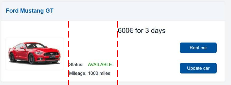
The parts are next to each other, so we add a GemRow:
@GemCard(
  title = c.make + " " + c.model + " " + c.name,
  component = @GemRow(
    components = [
      @GemImage(width = "200px", source = "assets/images/" + c.make + ".jpg"),
      /* text */
      /* text and buttons */
    ]
  )
);
Iteration 4: the last splits
The image is in place, the remaining parts split like this:
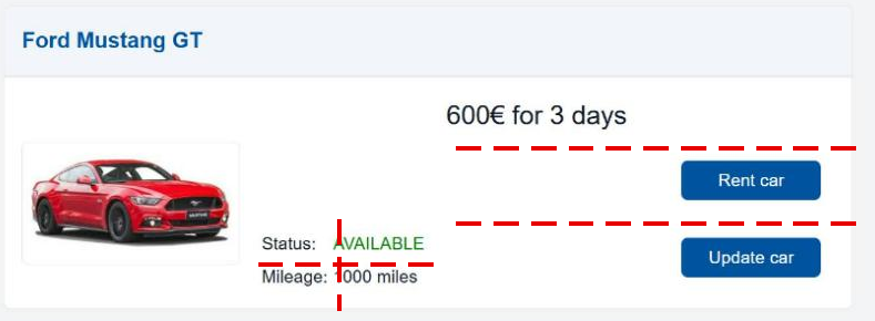
The status and mileage information is aligned in a grid pattern. The price and the buttons are stacked vertically:
@GemRow(
  components = [
    @GemImage(width = "200px", source = "assets/images/" + c.make + ".jpg"),
    @GemGrid(rows = [
      [
        @GemText(value = "Status:"),
        @GemText(
          value = c.rentableStatus,
          color = c.rentableStatus == RentableStatus.AVAILABLE ? "green" : "red"
        )
      ],
      [
        @GemText(value = "Mileage:"),
        @GemText(value = c.mileage + " miles")
      ]
    ]),
    @GemColumn(components = [
      @GemText(value = (c.costPerDay * 3) + "€ for 3 days", size = "1.5rem"),
      @GemButton(label = "Rent car", leftClick = rentCar(c)),
      @GemButton(
        label = "Update car",
        leftClick = navigate(@CarUpdate(car = c))
      )
    ])
  ]
)
GemGrid allows you to define rows, cols, or for special cases cells. You
can get the same result using either of those, we use rows in this case,
because it is more intuitive to group a description of a characteristic and its
value into rows (otherwise you would have the columns ["Status:", "Mileage:"]
and ["Available", "23 miles"]).
Note
You could do what a grid does with columns and rows, but it's more difficult to make sure that gaps and spaces are correctly aligned.
Step 5: fine-tune the layout
For example, the column with the buttons:
- the column is 40 characters wide,
- there must be a 10 pixel gap between the buttons and the text,
- the column should be right aligned.
@GemColumn(width = "40ch", rowGap = "10px", hAlign = "right", components = [
  @GemText(/*...*/),
  @GemButton(/*...*/),
  @GemButton(/*...*/)
])
Leave the width of buttons to the theme
The MontiGem theme gives every GemButton a minimum width of 8rem. If you
set a smaller width, the button is wider than the space you gave it and
sticks out of the card.
Styling
Further styling requires manual handling and slightly differs from case to case. There is a similar process in all of the cases though:
- find the right style,
- define the found style in the right SCSS file.
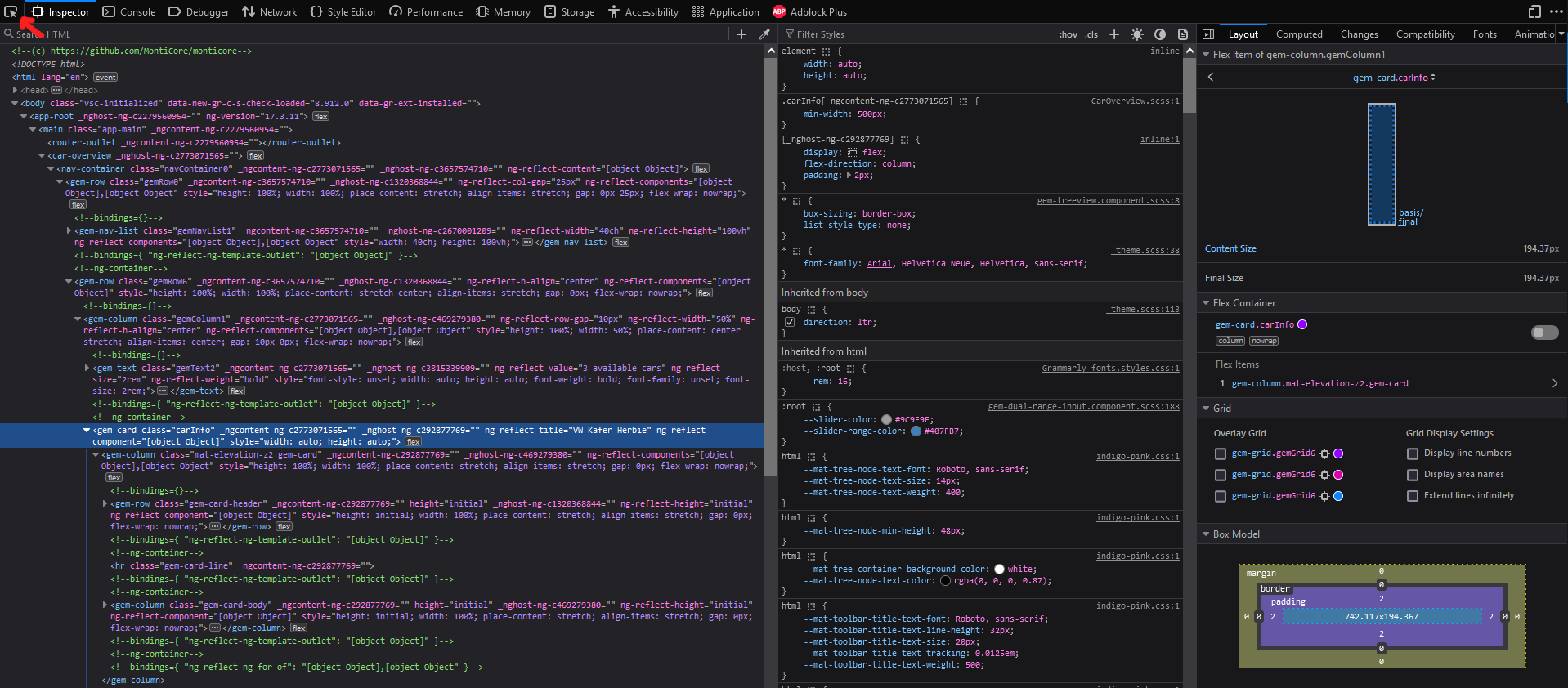
One of the efficient ways of finding the right style is to use the browser inspector and search for the element that needs to be modified.
You can either explore the HTML nodes of your page in the "Inspector" tab directly or use a selection tool (marked on the image), example of the inspector in Firefox:
Selected node:
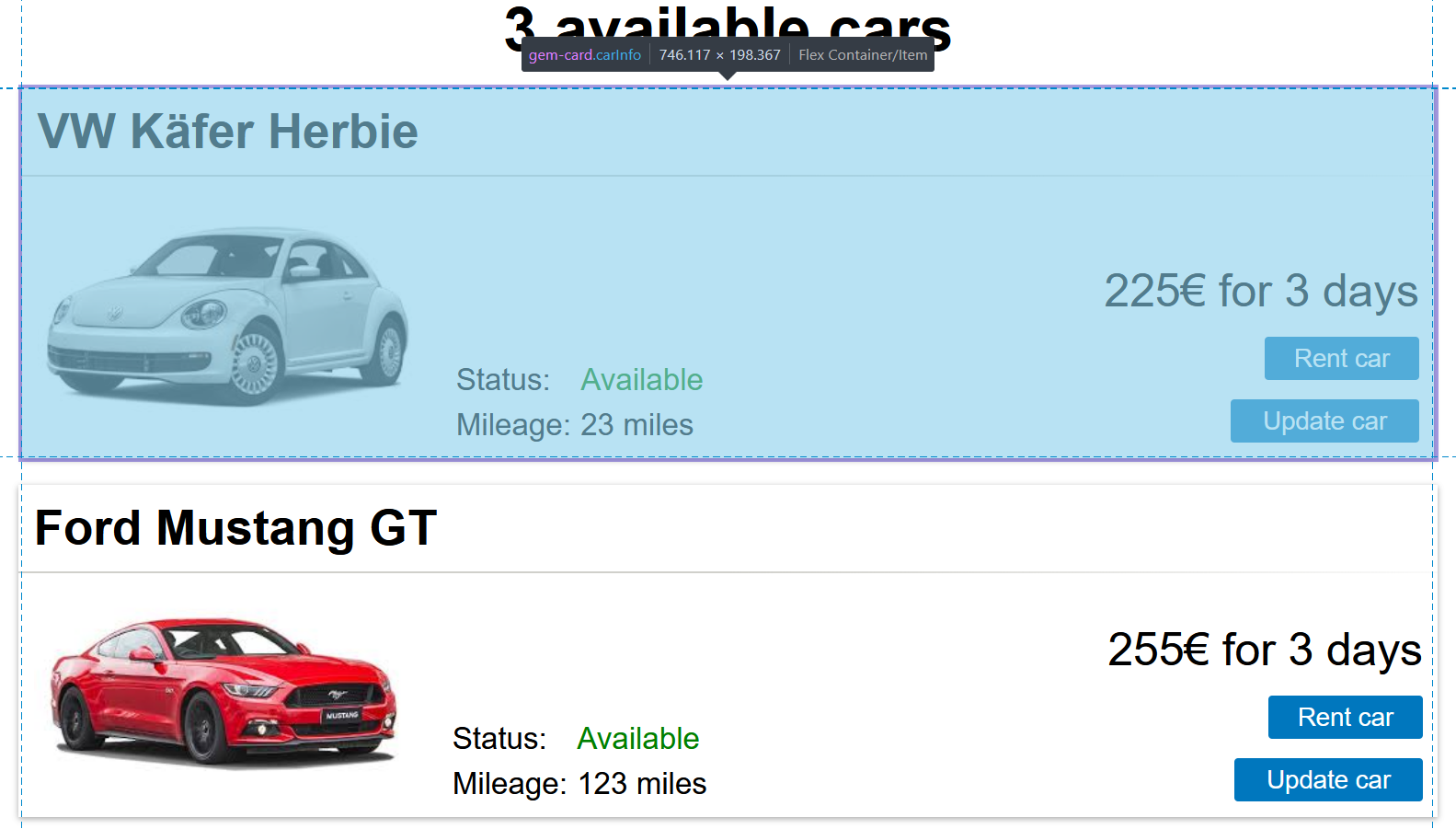
In the inspector you can find a lot of information, including styles. Typically
you would want to modify a CSS class of the HTML node. In the given example we
want to add a red background for each card (we actually don't want that, it's
easy to see though). We can experiment with the styles directly in the inspector
by adding a style to an element or one of its classes (typically you should
prefer classes), here a class carInfo (the dot before the name means that it is
a CSS class):
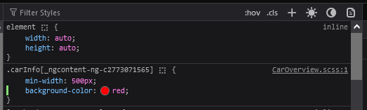
The result: the red background shows as a red frame around each card, because the title and the body of the card have their own background.
The first step of finding out what changes of CSS properties we need is done. Next is to decide where to put the changes.
Styling one component instance
If you want the changes to be specific to some component instance, you can specify the id (name) of the component in the model, e.g.:
carInfo@GemCard(
  /*...*/
)
The carInfo id is also used as the name of a CSS class in the generated code.
After that you specify the style in the SCSS file of the component (see the
chapter about the TOP mechanism). For the carInfo
components inside CarOverview, create the file
frontend/src/main/gui/gui/CarOverview.scss:
.carInfo {
  min-width: 500px;
  background-color: red;
}
A new SCSS file needs one generate
The dev server does not pick up a newly created SCSS file on its own, because the generated Angular component has to reference it first. Run
./gradlew :frontend:generate
once after creating the file. Later edits of the file are picked up automatically.
Styling inside a library component
It gets a bit tricky if you need to change the style of an internal part of the component. For example, if we want to change the color of the line separating the card title and the card body, we would again find the right element:
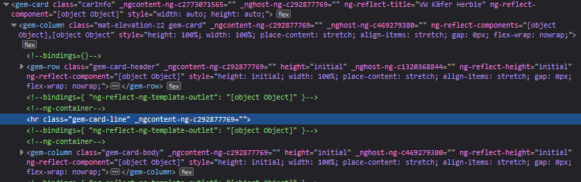
But since the element is inside GemCard, which is a component that is outside
of the app, the normal modification rule will not work. Instead, we have to add
:host ::ng-deep before the rule:
:host ::ng-deep .gem-card-line {
  background: aqua;
}
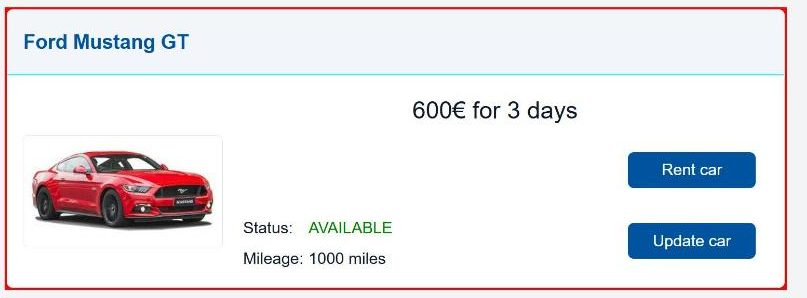
The additional :host ::ng-deep part of the style makes sure the style is
applied to the card line but only for the current page (CarOverview).
The styles you apply can target any elements and you can use different selectors to specify what exact elements should be targeted. If, for example, an element doesn't have a class, but is inside an element with a class, you can use this information. For example, a different way to target the card line:
:host ::ng-deep .carInfo hr {
  background: aqua;
}
Here we select a child with the tag hr inside an element with the class
.carInfo.
Global styles
If you want the changes to be global, e.g. change the line color for every card
on every page, put the style into the styles.scss file of your application
(create the file if it doesn't exist). The location is
frontend/config/src/styles.scss:
/* You can add global styles to this file, and also import other style files */
@import "../node_modules/@umlp/theme/src/main/gui/mc/fenix/theme/theme";

// make sure the default styles are included
@include montigem-theme();

// override one of the default styles
.gem-card-line {
  background: aqua;
}
MontiGem copies this file into the app. After creating or changing it, run
./gradlew :frontend:generate
Conditional styling
To change the style of a component based on a condition (e.g. "selected" vs
"unselected"), you can use a @guard to switch between two instances with
different identifiers.
Model:
@guard(isSelected()) {
  selectedItem@GemButton(label = item.name);
} else {
  unselectedItem@GemButton(label = item.name);
}
SCSS:
.selectedItem .gem-button {
  background-color: blue;
}
.unselectedItem .gem-button {
  background-color: grey;
}
Checkpoint
- The car overview shows one card per car with a picture, status, mileage, price and two buttons, like the screenshot above (your values differ, they come from your dummy data).
- "Update car" opens the update form, "Rent car" changes the status to
RENTEDand the color of the status text to red. - After creating
CarOverview.scssand runninggenerateonce, the cards have a red frame. Remove thebackground-coloragain when you have seen it.