GemTable
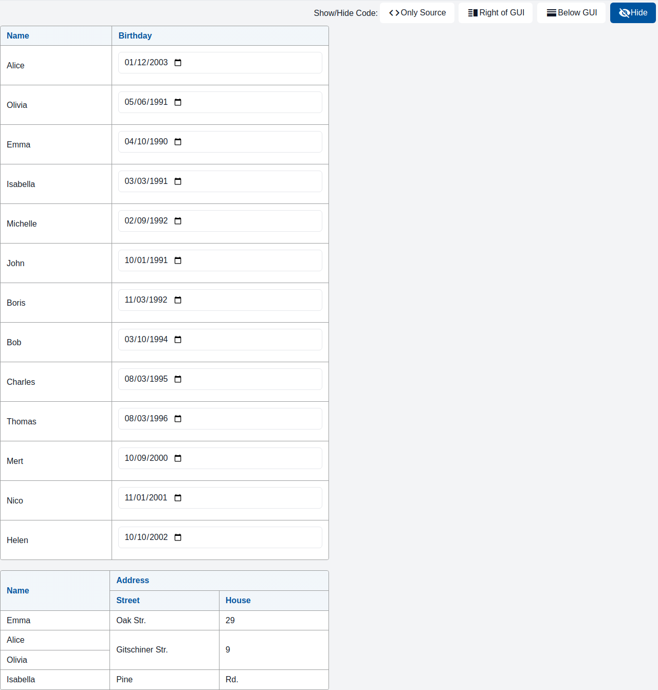
A table organizes and displays data in rows and columns.
Usage Example
/* (c) https://github.com/MontiCore/monticore */

package example_table;

import mc.fenix.table.GemTable;
import mc.fenix.table.GemTableHeader;
import mc.fenix.table.GemTableHeaderCell;
import mc.fenix.table.GemTableRow;
import mc.fenix.table.GemTableRowCell;
import mc.fenix.basic.GemText;
import mc.fenix.input.GemTextInput;
import Domain.*;
import mc.fenix.arrange.GemColumn;
import common.ExamplePage;

page GemTableExample(List<Person> persons) {
  @ExamplePage(
    component = @GemColumn(rowGap = "20px", width = "50%", components = [
      @GemTable(
        headers = [
          @GemTableHeader(cols = ["Name", "Birthday"])
        ],
        body = [@iterate(Person p : persons) {
          @GemTableRow(cols = [
            @GemText(value = p.name),
            @GemTextInput(
              inputType = "date",
              entry = p.birthday
            )
          ]);
        }]
      ),
      @GemTable(
        layout = "fixed",
        headers = [
          @GemTableHeader(cells = [
            @GemTableHeaderCell(rowSpan = 2, content = @GemText(value = "Name")),
            @GemTableHeaderCell(colSpan = 2, content = @GemText(value = "Address"))
          ]),
          @GemTableHeader(cols = ["Street", "House"])
        ],
        body = [
          @GemTableRow(cells = [
            @GemTableRowCell(content = @GemText(value = "Emma")),
            @GemTableRowCell(content = @GemText(value = "Oak Str.")),
            @GemTableRowCell(content = @GemText(value = "29"))
          ]),
          @GemTableRow(cells = [
            @GemTableRowCell(content = @GemText(value = "Alice")),
            @GemTableRowCell(rowSpan = 2, content = @GemText(value = "Gitschiner Str.")),
            @GemTableRowCell(rowSpan = 2, content = @GemText(value = "9"))
          ]),
          @GemTableRow(cells = [
            @GemTableRowCell(content = @GemText(value = "Olivia"))
          ]),
          @GemTableRow(cells = [
            @GemTableRowCell(content = @GemText(value = "Isabella")),
            @GemTableRowCell(content = @GemText(value = "Pine")),
            @GemTableRowCell(content = @GemText(value = "Rd."))
          ])
        ]
      )
    ]),
    basePath = "example_table",
    componentName = "GemTableExample"
  );
}
TypeScript implementation:
/* (c) https://github.com/MontiCore/monticore */
package example_table;

import umlp.jsweet.extension.annotation.Component;

@Component
public class GemTableExample extends GemTableExampleTOP {
}
GUI Model
component GemTable(
  String width = "auto",
  String height = "auto",
  String layout = "auto",
  List<GUIViewElement> headers,
  List<GUIViewElement> body
)
| Name | Type | Description | Default value |
|---|---|---|---|
width |
String |
Width of the component in px, %, vh. By default collapses to a minimal possible height with respect to content. |
"auto" |
height |
String |
Height of the component in px, %, vh. By default collapses to a minimal possible height with respect to content. |
"auto" |
layout |
String |
Table layout. Commonly used layouts: "auto": The width of the columns is adjusted to fit its content (default). "fixed": The width of the columns is evenly spread. |
"auto" |
headers |
List<GUIViewElement> |
Header(s) of a table. Normally set to a list of GemTableHeader. |
|
body |
List<GUIViewElement> |
Body of a table. Normally set to a list of GemTableRow. |