GemTextareaInput
The component is a text area with an optional label. It is used whenever a multi-line user text input is required, e.g. for comment fields, feedback, etc.
Usage Example
/* (c) https://github.com/MontiCore/monticore */
package example_input;

import Domain.Person;

import mc.fenix.input.GemTextareaInput;
import common.ExamplePage;
import mc.fenix.arrange.GemColumn;

page GemTextareaInputExample(List<Person> persons) {
  @ExamplePage(
    component = @GemColumn(components = [
      @iterate(Person p : persons) {
        @GemTextareaInput(
          labelText = p.name + ":",
          entry = p.aboutMe
        );
      }
    ]),
    basePath = "example_input",
    componentName = "GemTextareaInputExample"
  );
}
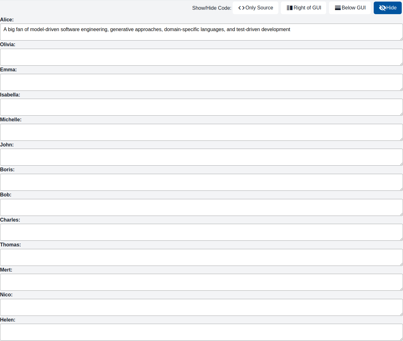
GUI Model
component GemTextareaInput(
  String id,
  String labelText,
  ?String entry,
  boolean disabled = false,
  String placeholder = "",
  String width = "100%",
  String height = "100%",
  GemTextareaInputValidity validity,
  Event<Object> keyRelease,
  Event<Object> keyPress,

  String resize ="auto"
)
| Name |
Type |
Description |
Default value |
id |
String |
Deprecated |
|
labelText |
String |
Text describing the input field. |
|
entry |
?String |
The input field's value. If it is linked to a variable, the value of the variable will change when the user enters a new value. |
|
disabled |
boolean |
Whether the input field is disabled. |
false |
placeholder |
String |
Text displayed when the field is empty. |
"" |
width |
String |
Width of the input field. |
"100%" |
height |
String |
Height of the input field. |
"100%" |
validity |
GemTextareaInputValidity |
An object representing the validation status of the field. |
|
keyRelease |
Event<Object> |
Callback that is executed when a key is released. |
|
keyPress |
Event<Object> |
Callback that is executed when a key is pressed. |
|
resize |
String |
Option how to let the user resize the InputArea. Possible options: none,both,horizontal,vertical,initial,inherit |
"auto" |
Types
GemTextareaInputTypes
package mc.fenix.input;

classdiagram GemTextareaInputTypes {

  public class GemTextareaInputValidity {
    String status;
    String message;
    +GemTextareaInputValidity(String status);
    +GemTextareaInputValidity(String status, String message);
  }

}
GemTextareaInputValidity
| Name |
Type |
Description |
Default value |
status |
String |
The validation status. Possible values: "Error": There is a problem or issue that needs attention. "Unchecked": The input has not been inspected. "Success": Positive validation result. "Warning": There is a potential issue that should be noted. |
|
message |
String |
A message to be displayed as a tooltip with the status |
|