GemRangeInput
This component displays a label with a slider that allows users to select a value within a specified range. This component can be used in forms and other interactive interfaces to allow users to select a range of values easily.
Usage Example
/* (c) https://github.com/MontiCore/monticore */
package example_input;

import mc.fenix.input.GemRangeInputTypes.Marker;
import mc.fenix.input.GemRangeInput;
import mc.fenix.input.GemDualRangeInput;
import common.ExamplePage;
import mc.fenix.arrange.GemColumn;

page GemRangeInputExample() {
  @ExamplePage(
    component = @GemColumn(components = [
      @GemRangeInput(
        id = "satisfaction",
        labelText = "Satisfaction:",
        vertical = false,
        step = 1,
        minValue = 1,
        maxValue = 5,
        size = "300px",
        ticks = [
          Marker(1, "very bad"),
          Marker(2, "bad"),
          Marker(3, "neutral"),
          Marker(4, "good"),
          Marker(5, "very good")
        ]
      ),

      @GemRangeInput(
        id = "priceFilter",
        labelText = "price (€):",
        vertical = false,
        step = 50,
        minValue = 0,
        maxValue = 500,
        size = "350px",
        snapping = true
      ),

      @GemRangeInput(
          id = "projectPhase",
          labelText = "Projectphase:",
          vertical = true,
          step = 1,
          minValue = 1,
          maxValue = 4,
          size = "250px",
          ticks = [
            Marker(1, "planning"),
            Marker(2, "development"),
            Marker(3, "testing"),
            Marker(4, "release")
          ]
        ),

      @GemRangeInput(
        id = "volumeControlVertical",
        labelText = "Volume:",
        vertical = true,
        step = 5,
        minValue = 0,
        maxValue = 100,
        size = "200px",
        ticks = [
          Marker(0, "0%"),
          Marker(25, "25%"),
          Marker(50, "50%"),
          Marker(75, "75%"),
          Marker(100, "100%")
        ]
      ),
      @GemDualRangeInput(
        id = "priceRange",
        labelText = "Price Range (€):",
        vertical = false,
        step = 5,
        minValue = 0,
        maxValue = 200,
        size = "300px",
        ticks = [
          Marker(0, "0€"),
          Marker(50, "50€"),
          Marker(100, "100€"),
          Marker(150, "150€"),
          Marker(200, "200€")
        ]
      ),
      @GemDualRangeInput(
        id = "tempRange",
        labelText = "Temperature (°C):",
        vertical = true,
        step = 1,
        minValue = 5,
        maxValue = 35,
        size = "250px",
        ticks = [
          Marker(5, "5°C"),
          Marker(15, "15°C"),
          Marker(25, "25°C"),
          Marker(35, "35°C")
        ]
      )
    ]),
    basePath = "example_input",
    componentName = "GemRangeInputExample"
  );
}
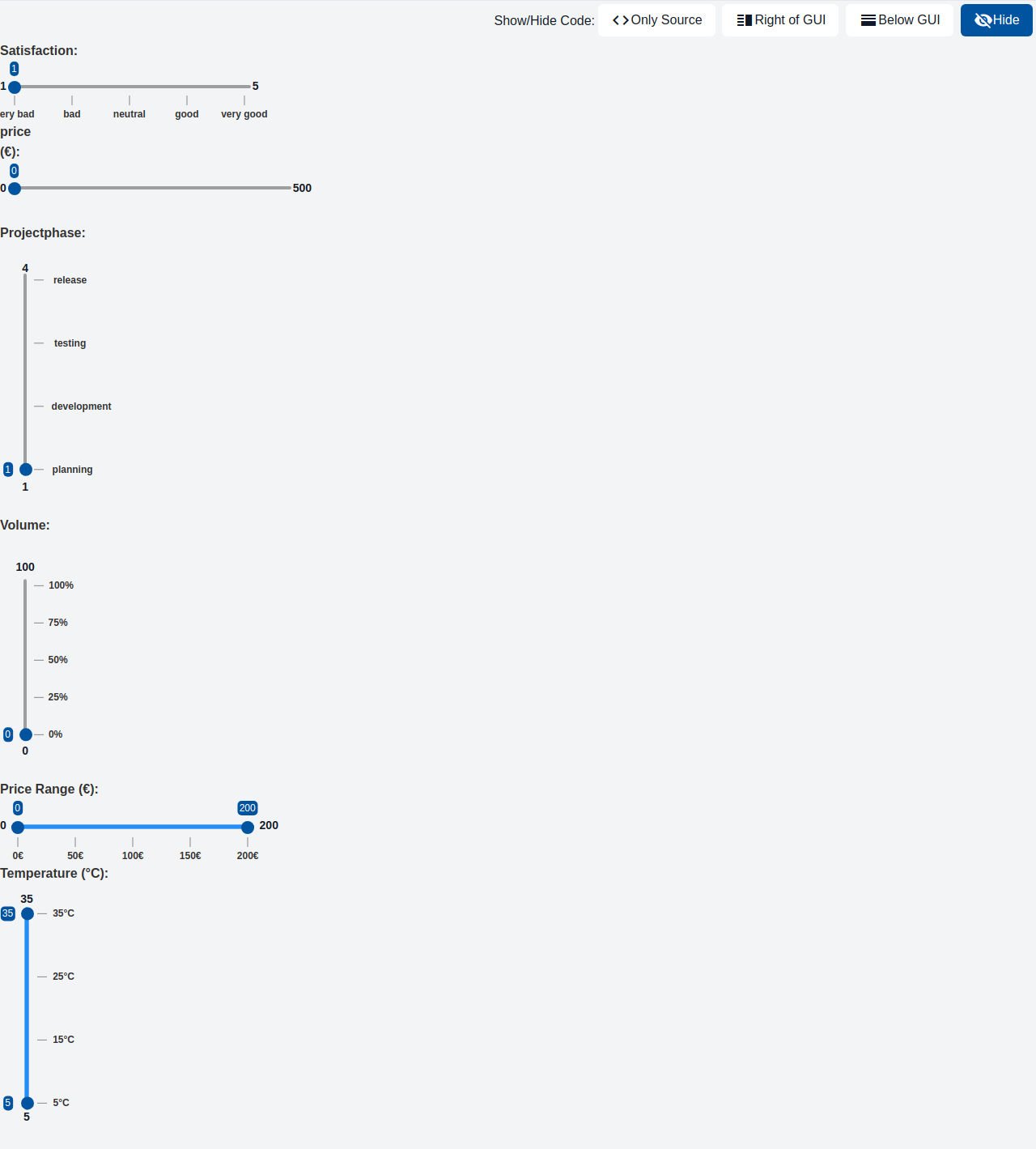
GUI Model
component GemRangeInput(
  String id,
  String labelText,
  Boolean vertical,
  Integer step,
  ?Integer value,
  Integer minValue,
  Integer maxValue,
  List<Marker> ticks,
  Boolean snapping = false,
  String size
)
| Name | Type | Description | Default value |
|---|---|---|---|
id |
String |
The component's id; used to configure the styles | |
labelText |
String |
Label of the range input | |
vertical |
Boolean |
This boolean input allows you to specify whether the slider should be displayed vertically or horizontally, with the default appearance being horizontal. It is advisable to omit this input entirely rather than setting it to false when you desire a horizontal appearance. | |
step |
Integer |
Allows to specify a fixed increment for selecting values in the range slider. | |
value |
?Integer |
The slider's current number value. It is recommended that you bind it to a number variable so that the variable displays the current slider value. | |
minValue |
Integer |
The slider's minimum value. | |
maxValue |
Integer |
The slider's maximum value. | |
ticks |
List<Marker> |
Optional tick marks shown along the slider. Each Marker provides a numeric value and an optional label. | |
snapping |
Boolean |
Enable snapping to the nearest tick marker. When true, the slider snaps to the closest ticks.value; minValue and maxValue are also considered snap targets. | false |
size |
String |
Width of the slider track as a valid CSS length (e.g., "320px", "100%", "20rem"). |
Types
GemRangeInputTypes
package mc.fenix.input;

classdiagram GemRangeInputTypes {
  public class Marker {
    Integer value;
    String label;
    +Marker(Integer value);
    +Marker(Integer value, String label);
  }
}
Marker
| Name | Type | Description | Default value |
|---|---|---|---|
value |
Integer |
Numeric value of the tick on the slider. | |
label |
String |
Optional text label shown near the tick mark. If null or empty, no label will be rendered. |