GemRadioInput
This component represents a radio button with a label. It is intended for use in forms or other scenarios where users must choose one of several options.
Usage Example
/* (c) https://github.com/MontiCore/monticore */
package example_input;

import mc.fenix.input.GemRadioInput;
import mc.fenix.input.GemDropdownInput;
import mc.fenix.basic.GemText;

import Domain.Role;
import Domain.Person;
import common.ExamplePage;
import mc.fenix.arrange.GemColumn;

page GemRadioInputExample(List<Person> persons) {
  @ExamplePage(
    component = @GemColumn(components = [
      @iterate(Person p : persons) {
        @GemText(value = getPersonRoleInfo(p));
        @iterate(Role r : getRoles()) {
          @GemRadioInput(
            labelText = r,
            value = r,
            selectedValue = p.role,
            group = getGroupName(p)
          );
        }
      },
      @GemText(value="Group 1"),
      @GemRadioInput(
        id = "genderMale",
        labelText = "Male",
        value = "male",
        group = "first"
      ),
      @GemRadioInput(
        id = "genderFemale",
        labelText = "Female",
        value = "female",
        group = "first"
      ),
      @GemRadioInput(
        id = "genderOther",
        labelText = "Other",
        value = "other",
        group = "first"
      ),
      @GemText(value="Group 2"),
      @GemRadioInput(
        id = "a",
        labelText = "A",
        value = "valueA",
        group = "second"
      ),
      @GemRadioInput(
        id = "b",
        labelText = "B",
        value = "valueB",
        group = "second"
      )
    ]),
    basePath = "example_input",
    componentName = "GemRadioInputExample"
  );
}
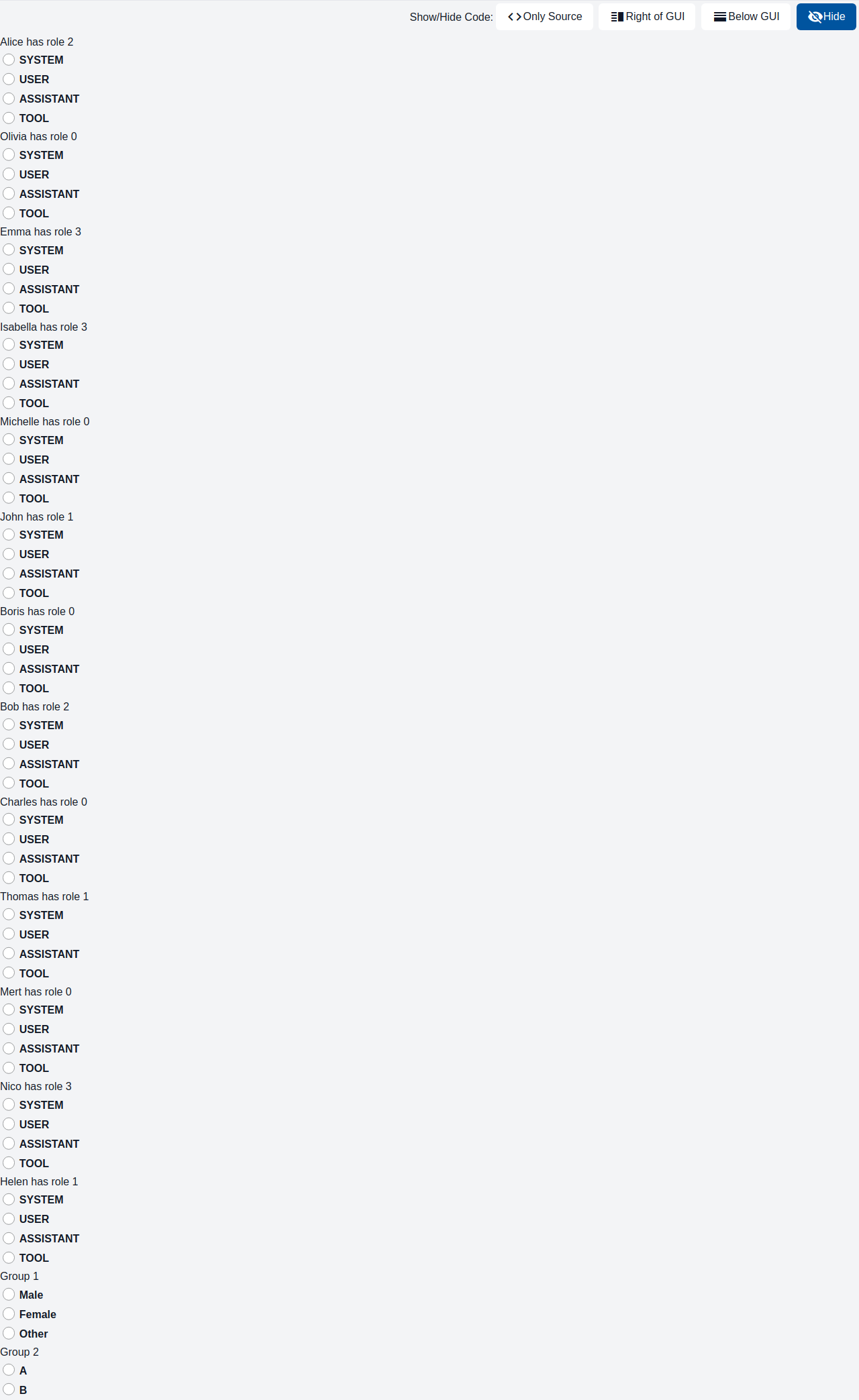
TypeScript implementation:
package example_input;

import domain.Person;
import domain.Role;

import java.util.ArrayList;
import java.util.List;

public class GemRadioInputExample extends GemRadioInputExampleTOP {

  @Override
  public List<Role> getRoles() {
    List<Role> roles = new ArrayList<Role>();
    for (Role role : Role.values()) {
      roles.add(role);
    }
    return roles;
  }

  @Override
  public String getPersonRoleInfo(Person person) {
    return person.getName() + " has role " + person.getRole().toString();
  }

  @Override
  public String getGroupName(Person person) {
    return "roles" + person.getName();
  }
}
GUI Model
component GemRadioInput(
  String id,
  String labelText,
  String value,
  String labelPosition,
  boolean disabled = false,
  ?String selectedValue,
  String group
)
| Name | Type | Description | Default value |
|---|---|---|---|
id |
String |
The component's id; used to configure the styles. | |
labelText |
String |
Text describing the radio button's option. | |
value |
String |
Value represented by this radio button within its group. | |
labelPosition |
String |
Position of the label relative to the radio button. | |
disabled |
boolean |
If true, the radio button cannot be selected. | false |
selectedValue |
?String |
Currently selected value within the group; used to determine if this radio button is checked. | |
group |
String |
Name of the group; if multiple GemRadioButton components share the same group name, only one radio button per group can be selected at a time. |