GemCheckBoxInput
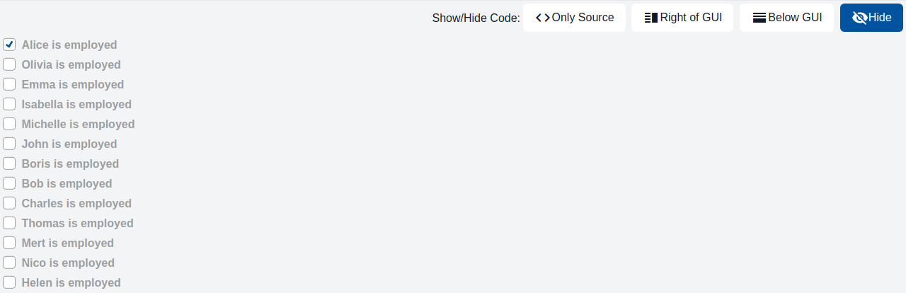
The component is a checkbox with a label. It is used whenever an input for a binary choice is required, e.g., agreeing to terms and conditions or opting in to a newsletter.
Usage Example
/* (c) https://github.com/MontiCore/monticore */
package example_input;

import Domain.Person;

import mc.fenix.input.GemCheckBoxInput;
import common.ExamplePage;
import mc.fenix.arrange.GemColumn;

page GemCheckBoxInputExample(List<Person> persons) {
  @ExamplePage(
    component = @GemColumn(components = [
      @iterate(Person p : persons) {
        @GemCheckBoxInput(
          labelText = p.name + " is employed",
          checked = p.employed
        );
      }
    ]),
    basePath = "example_input",
    componentName = "GemCheckBoxInputExample"
  );
}
GUI Model
component GemCheckBoxInput(
  String id,
  String labelPosition = "right",
  String labelText = "",
  boolean disabled = false,
  ?boolean checked
)
| Name | Type | Description | Default value |
|---|---|---|---|
id |
String |
A unique id ensures proper screen reader functionality for the checkbox description. | |
labelPosition |
String |
The position of the label, can be "left" or "right". |
"right" |
labelText |
String |
The text of the checkbox label. | "" |
disabled |
boolean |
Whether the input field is disabled. | false |
checked |
?boolean |
Indicates if the checkbox is checked (true) or not (false). |