GemRow
GemRow is a container which arranges input elements horizontally.
Usage Examples
/* (c) https://github.com/MontiCore/monticore */
package example_arrange;

import mc.fenix.arrange.GemRow;
import mc.fenix.basic.GemText;
import mc.fenix.arrange.GemColumn;
import common.ExamplePage;

page GemRowExample() {
  @ExamplePage(
    component = @GemColumn(components = [
      @GemRow(
        colGap = "15px",
        components = [
          @GemText(value = "First col"),
          @GemText(value = "Second col"),
          @GemText(value = "Third col")
        ]
      )
    ]),
    basePath = "example_arrange",
    componentName = "GemRowExample"
  );
}

/* (c) https://github.com/MontiCore/monticore */
package example_arrange;

import mc.fenix.arrange.GemRow;
import mc.fenix.basic.GemText;
import mc.fenix.arrange.GemColumn;
import common.ExamplePage;

/**
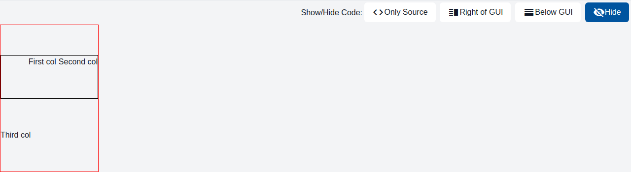
  Following example shows a `200 x 300` row. The vertical alignment of
  elements is set to evenly distribute extra space to the top of the inner
  row, between the inner row and the "Third col", and to the bottom of the
  "Third col". The outer row is set to wrap elements that cannot fit into the
  container. Since the inner row has width of `100%`, the "Third col" is
  forced to wrap. The inner row sets horizontal align to `"right"` which forces
  "First col" and "Second col" to the right of the container. The `colGap` is set
  to `"5px"` which creates a gap between the "First col" and "Second col".
*/
page GemRowExample2() {
  @ExamplePage(
    component = @GemColumn(components = [
      outer@GemRow(
        width = "200px",
        height = "300px",
        vAlign = "space-evenly",
        wrap = "wrap",
        components = [
          inner@GemRow(
            width = "100%",
            height = "30%",
            hAlign = "right",
            colGap = "5px",
            components = [
              @GemText(value = "First col"),
              @GemText(value = "Second col")
            ]
          ),
          @GemText(value = "Third col")
        ]
      )
    ]),
    basePath = "example_arrange",
    componentName = "GemRowExample2"
  );
}
GUI Model
component GemRow(
  String height = "auto",
  String width = "auto",
  String hAlign = "stretch",
  String vAlign = "stretch",
  String rowGap = "0",
  String colGap = "0",
  String wrap = "nowrap",
  List<GUIViewElement> components,
  GUIViewElement component,
  String style = ""
)
| Name | Type | Description | Default value |
|---|---|---|---|
height |
String |
Height of the component in px, %, vh, etc. |
"auto" |
width |
String |
Width of the component in px, %, vh, etc. |
"auto" |
hAlign |
String |
Horizontal alignment of the embedded components. Invalid values are ignored. Possible values: "left", "center", "right": Set position of the elements inside the container. "stretch": Stretch elements proportionally to fill space if the elements' size is not specified. "space-between": Distribute empty space equally between the elements. "space-around": Distribute empty space around each element equally. "space-evenly": Distribute empty space around the elements and make those gaps equal size. |
"stretch" |
vAlign |
String |
Vertical alignment of the embedded components. Invalid values are ignored. Possible values: "top", "center", "bottom": Set position of the elements inside the container. "stretch": Stretch elements proportionally to fill space if the elements' size is not specified. "space-between": Distribute empty space equally between the elements. "space-around": Distribute empty space around the elements equally. "space-evenly": Distribute empty space around the elements and make those gaps equal size. |
"stretch" |
rowGap |
String |
Gap between rows of elements in the container in px, %, vh, etc. Relevant when wrap is set to "wrap" or "wrap-reverse". |
"0" |
colGap |
String |
Gap between columns of elements in the container in px, %, vh, etc. |
"0" |
wrap |
String |
Set behavior for element wrapping. Invalid values are ignored. "nowrap": Elements are never wrapped. If elements do not into the container, a scrollbar appears. "wrap": Elements that do not fit into the container are wrapped, i.e. a new column is created to the right. "wrap-reverse": Similar to "wrap", but a new column is created to the left. |
"nowrap" |
components |
List<GUIViewElement> |
Components to display inside a column. | |
component |
GUIViewElement |
Deprecated. Shortcut for components property for the case when only one component has to be displayed. If both component and components are defined, component is shown first. |
|
style |
String |
Deprecated. | "" |