GemGrid
GemGrid is a container which arranges input elements in a grid pattern.
Usage Example
/* (c) https://github.com/MontiCore/monticore */
package example_arrange;

import mc.fenix.arrange.GemGrid;
import mc.fenix.arrange.GemGridCell;
import mc.fenix.basic.GemText;
import mc.fenix.arrange.GemColumn;
import common.ExamplePage;

/**
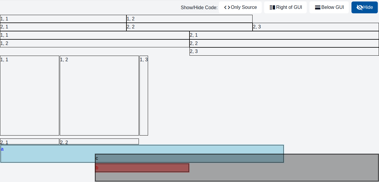
  Following example shows 4 grids.

  Grid 1 and 2 show simple cases. If a row contains less items than a maximum
  length row, the row is filled with empty cells to match the longest row.

  Grid 3 (`fixedGrid`) defines fixed width and height for the entire grid.
  Additionally, property `x` is set to specify widths of columns and implicetly
  defines how many columns (3) there are in the grid:
  - First column is `200px` wide.
  - Second column is `1fr` wide, i.e. `1 / amout_of_columns * grid_width` (1/3).
  - Third column has an automatic width (takes available space).

  Property `y` defines the rows of the grid accordingly.

  Grid 4 (`spanningGrid`) defines grid dimensions via properties `x` and `y`.
  The grid specifies cells using `GemGridCell` component that specifies start
  and end coordinates of the cell rectangle in the grid.
*/
page GemGridExample() {
  @ExamplePage(
    component = @GemColumn(components = [
      @GemGrid(
        rows = [
          [@GemText(value = "1, 1"), @GemText(value = "1, 2")],
          [@GemText(value = "2, 1"), @GemText(value = "2, 2"), @GemText(value = "2, 3")]
        ]
      ),

      @GemGrid(
        cols = [
          [@GemText(value = "1, 1"), @GemText(value = "1, 2")],
          [@GemText(value = "2, 1"), @GemText(value = "2, 2"), @GemText(value = "2, 3")]
        ]
      ),

      fixedGrid@GemGrid(
        width = "500px",
        height = "300px",
        x = ["200px", "1fr", "auto"],
        y = ["auto", "20px"],
        rowGap = "10px",
        colGap = "2px",
        rows = [
          [@GemText(value = "1, 1"), @GemText(value = "1, 2"), @GemText(value = "1, 3")],
          [@GemText(value = "2, 1"), @GemText(value = "2, 2")]
        ]
      ),

      spanningGrid@GemGrid(
        // 4x4
        x = ["1fr", "1fr", "1fr", "1fr"],
        y = ["1fr", "1fr", "1fr", "1fr"],
        cells = [
          cell1@GemGridCell(a = [1, 1], b = [3, 2], content = @GemText(width = "100%", height = "100%", value = "a", color = "blue")),
          cell2@GemGridCell(a = [2, 3], content = @GemText(width = "100%", height = "100%", value = "b", color = "red")),
          cell3@GemGridCell(a = [2, 2], b = [4, 4], content = @GemText(width = "100%", height = "100%", value = "c", color = "black"))
        ]
      )
    ]),
    basePath = "example_arrange",
    componentName = "GemGridExample"
  );
}
GUI Model
component GemGrid(
  String height = "auto",
  String width = "auto",
  String hAlign = "stretch",
  String vAlign = "stretch",
  String rowGap = "0",
  String colGap = "0",
  List<String> x,
  List<String> y,
  List<List<GUIViewElement>> rows,
  List<List<GUIViewElement>> cols,
  List<GUIViewElement> cells
)
| Name | Type | Description | Default value |
|---|---|---|---|
height |
String |
Height of the component in px, %, vh. By default collapses to a minimal possible height with respect to content. |
"auto" |
width |
String |
Width of the component in px, %, vh. By default collapses to a minimal possible height with respect to content. |
"auto" |
hAlign |
String |
Horizontal alignment of the embedded components. Invalid values are ignored. Possible values: "left", "center", "right": Set position of the elements inside the container. "stretch": Stretch elements proportionally to fill space if the elements' size is not specified. "space-between": Distribute empty space equally between the elements. "space-around": Distribute empty space around each element equally. "space-evenly": Distribute empty space around the elements and make those gaps equal size. |
"stretch" |
vAlign |
String |
Vertical alignment of the embedded components. Invalid values are ignored. Possible values: "top", "center", "bottom": Set position of the elements inside the container. "stretch": Stretch elements proportionally to fill space if the elements' size is not specified. "space-between": Distribute empty space equally between the elements. "space-around": Distribute empty space around the elements equally. "space-evenly": Distribute empty space around the elements and make those gaps equal size. |
"stretch" |
rowGap |
String |
Gap between rows of elements in the container in px, %, vh, etc. |
"0" |
colGap |
String |
Gap between columns of elements in the container in px, %, vh, etc. |
"0" |
x |
List<String> |
Specifies widths of grid columns. The amount of columns is equal to the length of the list. | |
y |
List<String> |
Specifies heights of grid rows. The amount of rows is equal to the length of the list. | |
rows |
List<List<GUIViewElement>> |
Rows of a grid. The length of the longest row defines the amount of columns, unless x is specified. If rows and cols are defined, rows are used. |
|
cols |
List<List<GUIViewElement>> |
Columns of a grid. The length of the longest column defines the amount of rows, unless y is specified. |
|
cells |
List<GUIViewElement> |
Cells of a grid. Normally set to a list of GemGridCell component that can specify the space occupied by a cell. The cells may overlap. If cells, rows and cols are defined, cells are used. |