GemCard
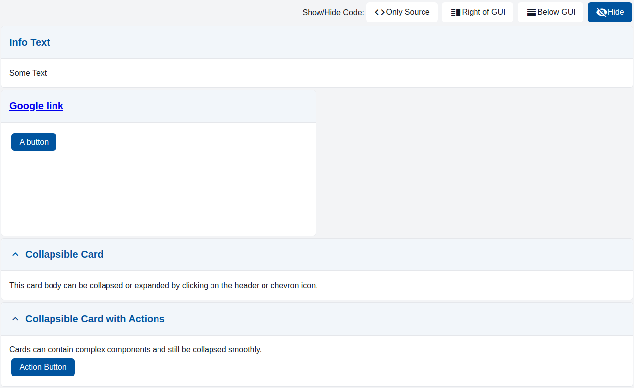
Card is a container with a header and a body. Both header and body may contain any elements, such as button, inputs, charts, etc.
Usage Example
/* (c) https://github.com/MontiCore/monticore */
package example_arrange;

import mc.fenix.arrange.GemCard;
import mc.fenix.basic.GemText;
import mc.fenix.basic.GemButton;
import mc.fenix.basic.GemLink;
import mc.fenix.arrange.GemColumn;
import common.ExamplePage;

page GemCardExample() {
  @ExamplePage(
    component = @GemColumn(components = [
      @GemCard(
        title = "Info Text",
        component = @GemText(value = "Some Text")
      ),
      @GemCard(
        width = "50%",
        height = "300px",
        titleComponent = @GemLink(url = "https://www.google.com/", text = "Google link"),
        component = @GemButton(label = "A button")
      ),
      @GemCard(
        title = "Collapsible Card",
        collapsible = true,
        component = @GemText(value = "This card body can be collapsed or expanded by clicking on the header or chevron icon.")
      ),
      @GemCard(
        title = "Collapsible Card with Actions",
        collapsible = true,
        component = @GemColumn(components = [
          @GemText(value = "Cards can contain complex components and still be collapsed smoothly."),
          @GemButton(label = "Action Button")
        ])
      )
    ]),
    basePath = "example_arrange",
    componentName = "GemCardExample"
  );
}
GUI Model
component GemCard(
  String height = "auto",
  String width = "auto",
  String title = "",
  GUIViewElement titleComponent,
  GUIViewElement component,
  boolean collapsible = false
)
| Name | Type | Description | Default value |
|---|---|---|---|
height |
String |
Height of the component in px, %, vh. By default collapses to a minimal possible height with respect to content. |
"auto" |
width |
String |
Width of the component in px, %, vh. By default collapses to a minimal possible width with respect to content. |
"auto" |
title |
String |
Text displayed at the top of the card. | "" |
titleComponent |
GUIViewElement |
A component displayed at the top of the card. If titleComponent and title are both set, the titleComponent will be used. |
|
component |
GUIViewElement |
Component displayed in body of the card. | |
collapsible |
boolean |
Whether the card can be collapsed/expanded. | false |